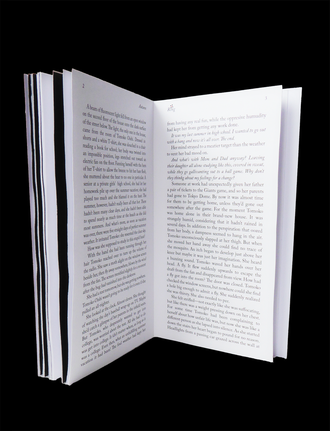
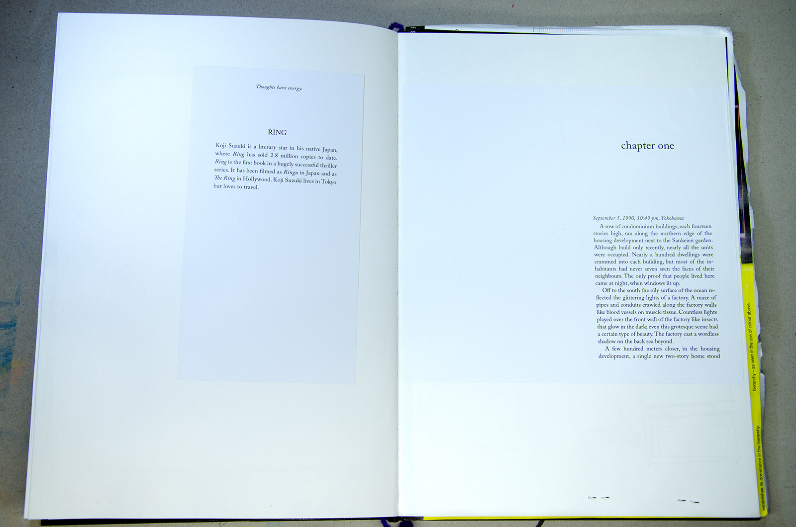
The goal of this project was to create a typographic design for the cover of a novel, as well as to include the initial pages of the book. I chose RING (1991) by Koji Suzuki (1957 - 2026), the renowned thriller that inspired both a Japanese and an American film adaptation, and the first in the Ring Novel Series.
To fully appreciate the nuances of my design choices, I encourage you to pick up the book and immerse yourself in its pages. The narrative is different from the interpretation in the films and reveals layers and details that enrich the overall experience.
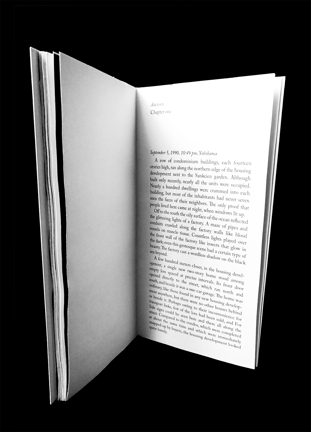
The final layout featured multiple black spreads that initially catch the eye. However, their true significance unfolds as the reader dives deeper into the narrative, revealing layers of meaning that enhance the storytelling experience.


DESIGN PROCESS
Before drawing any conclusions, it was crucial to explore various ideas and work on interpreting the core story to reach a final result. I took regular notes to trace the origins of the plot. Koji Suzuki skillfully plays with physics and biology, describing a compelling and believable narrative that feels as if it could exist within the laws of nature.
SPOILERS AHEAD
If you prefer not to know the details of the story, please stop scrolling now. Even if you've seen the film, the information in my notes may spoil the book's main plot, which offers much more insight into the origin of the 'seven-day-to-live video.'
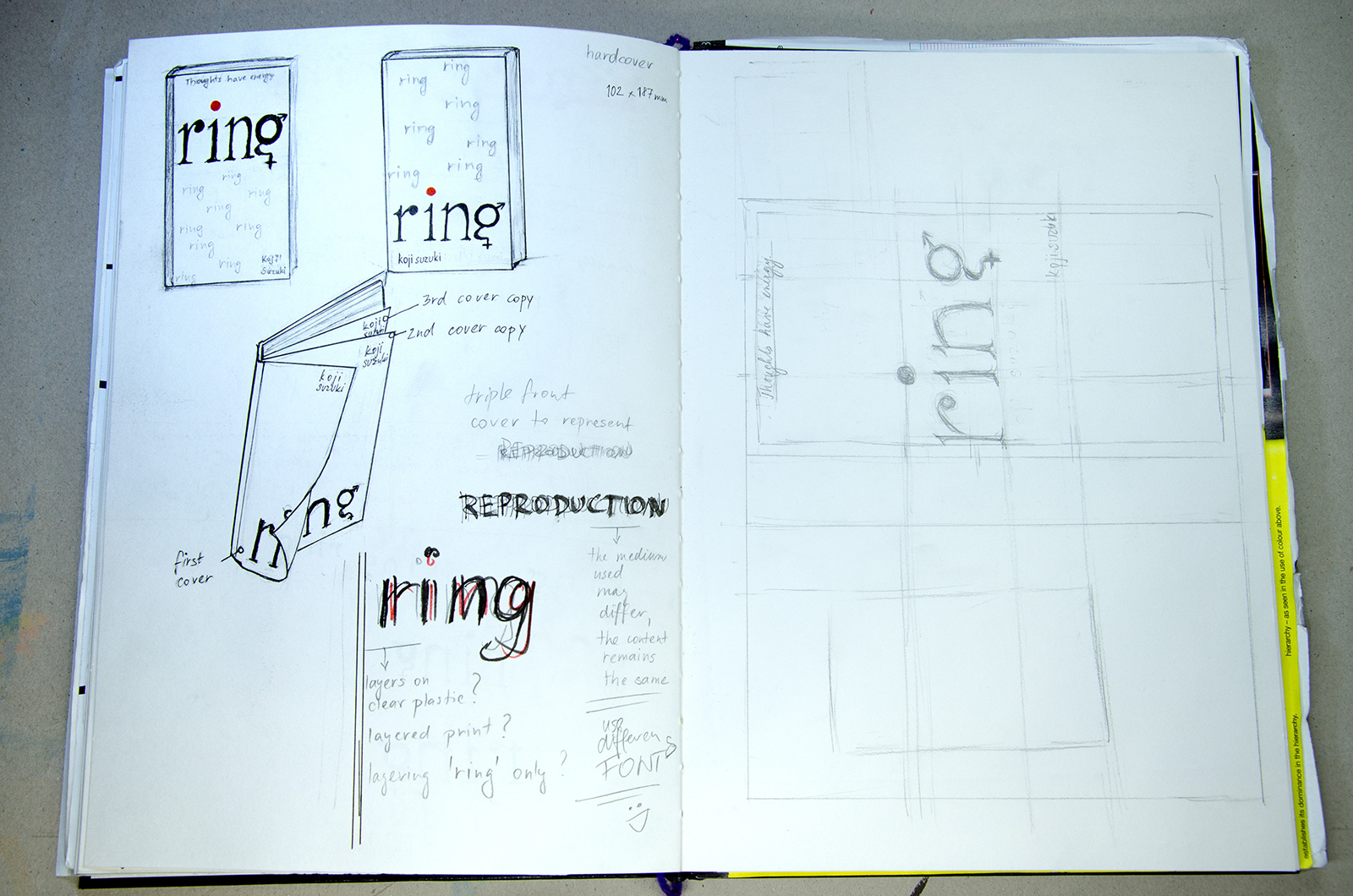
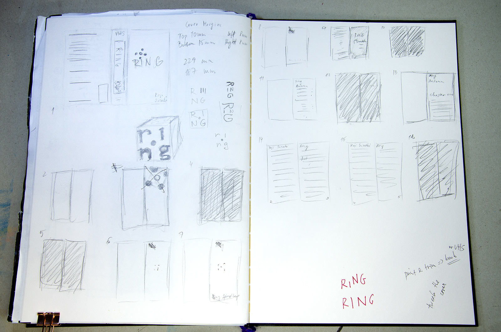
First step to the book cover, apart from reading the book itself, was to look at other interesting covers out there.
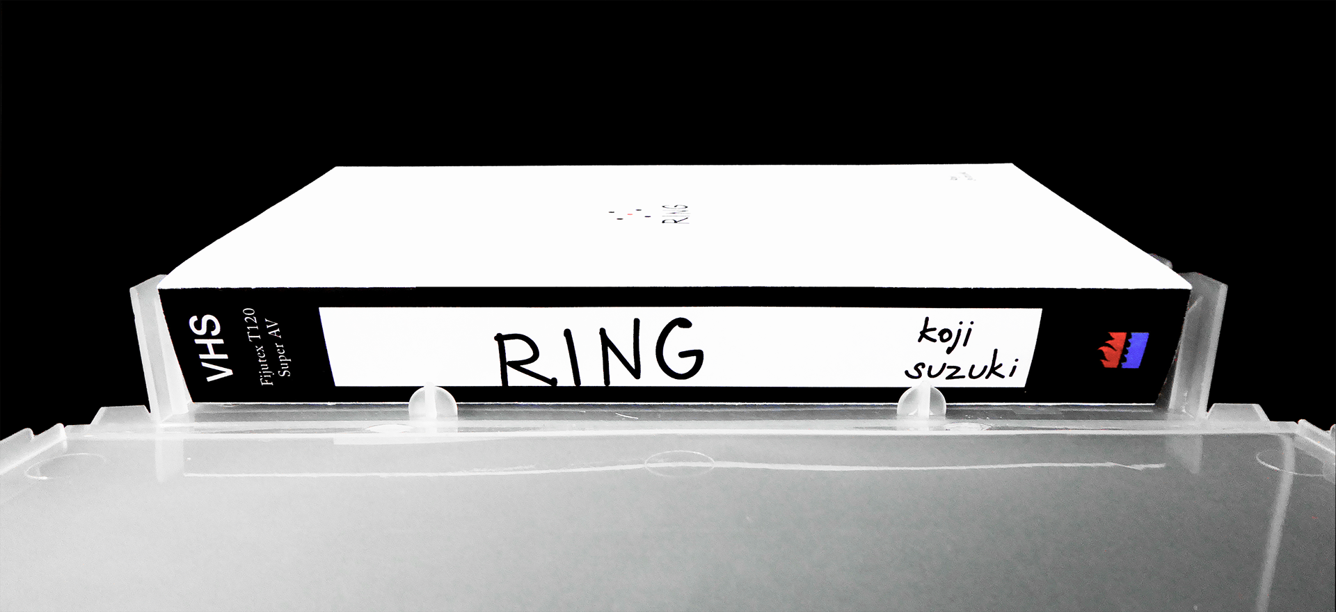
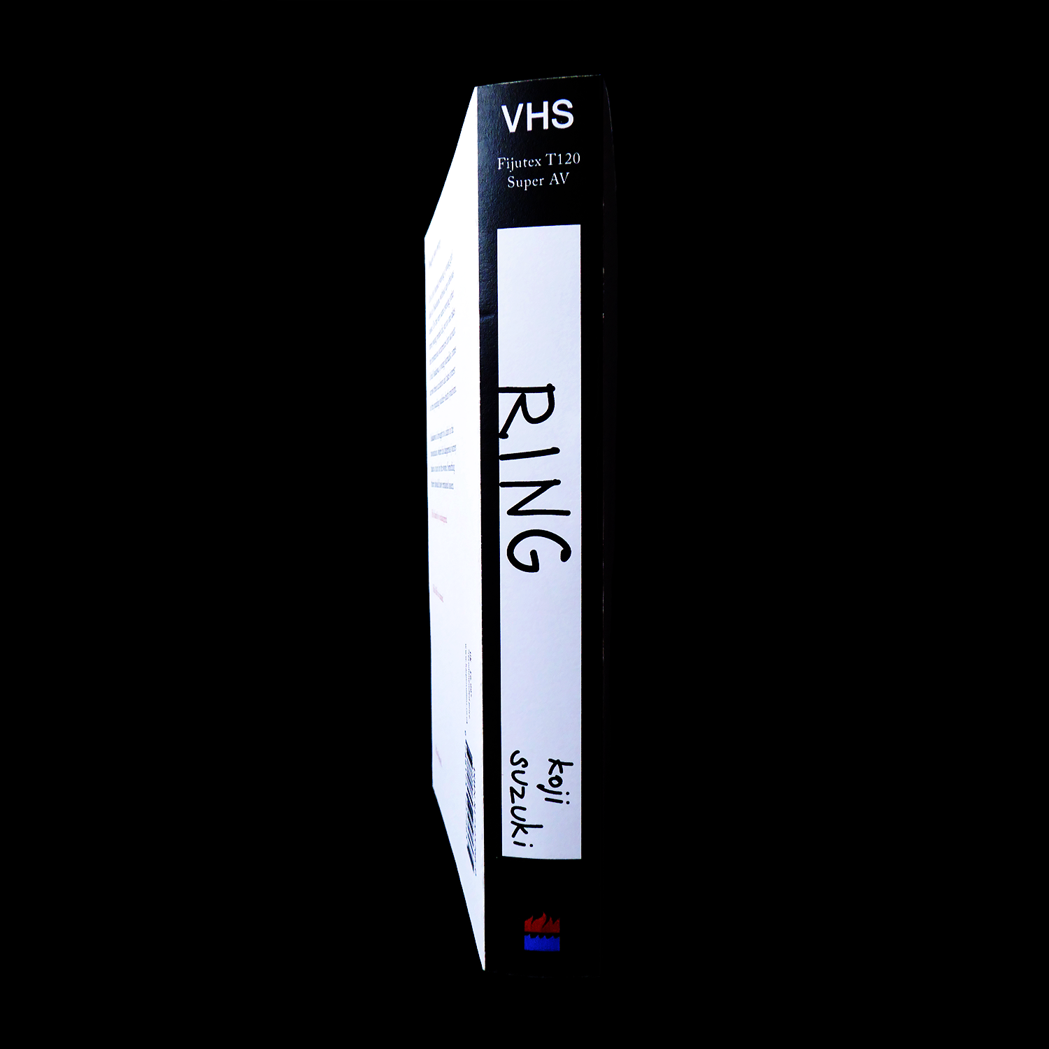
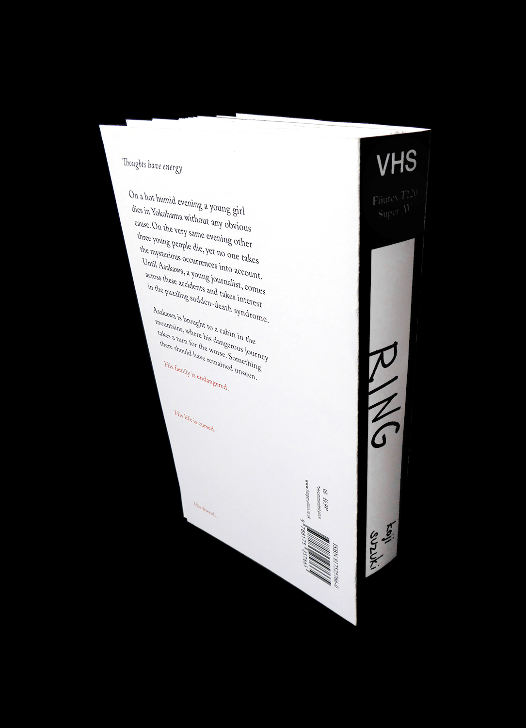
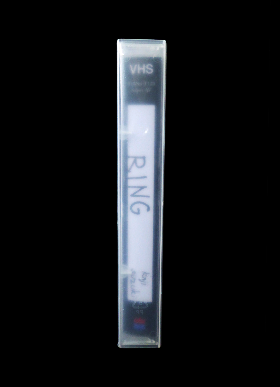
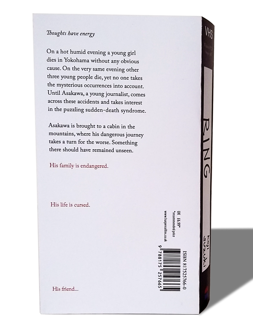
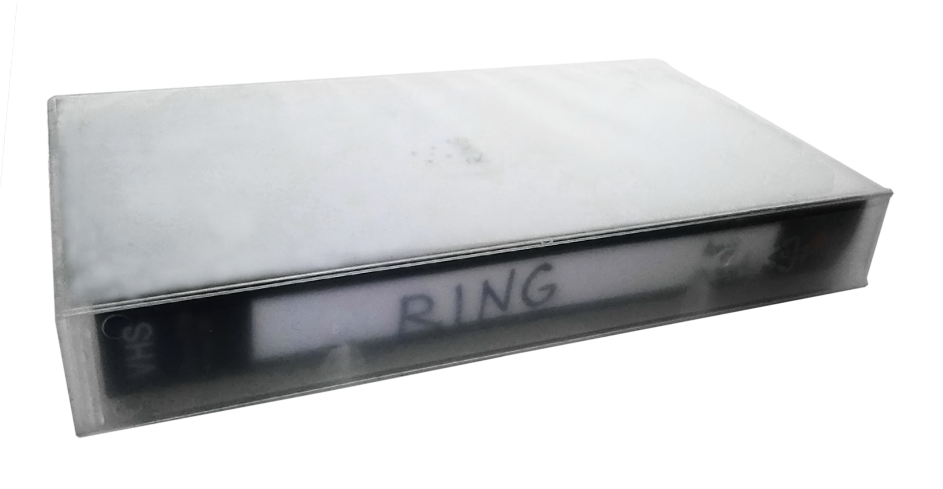
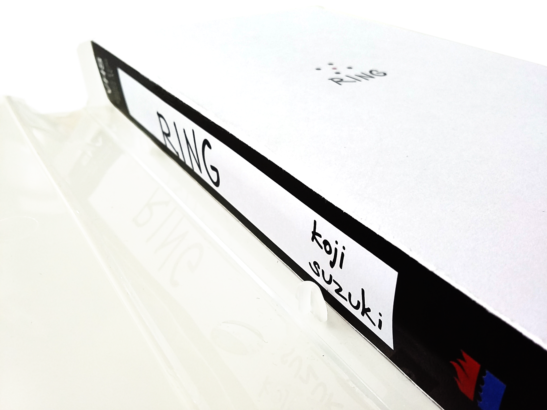
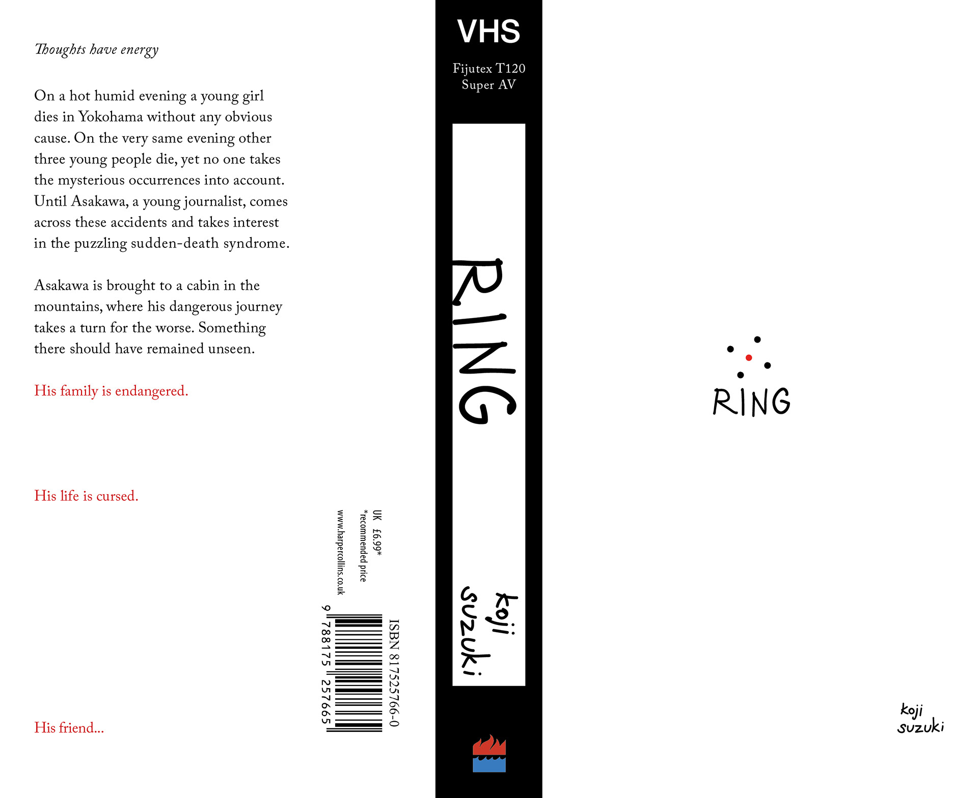
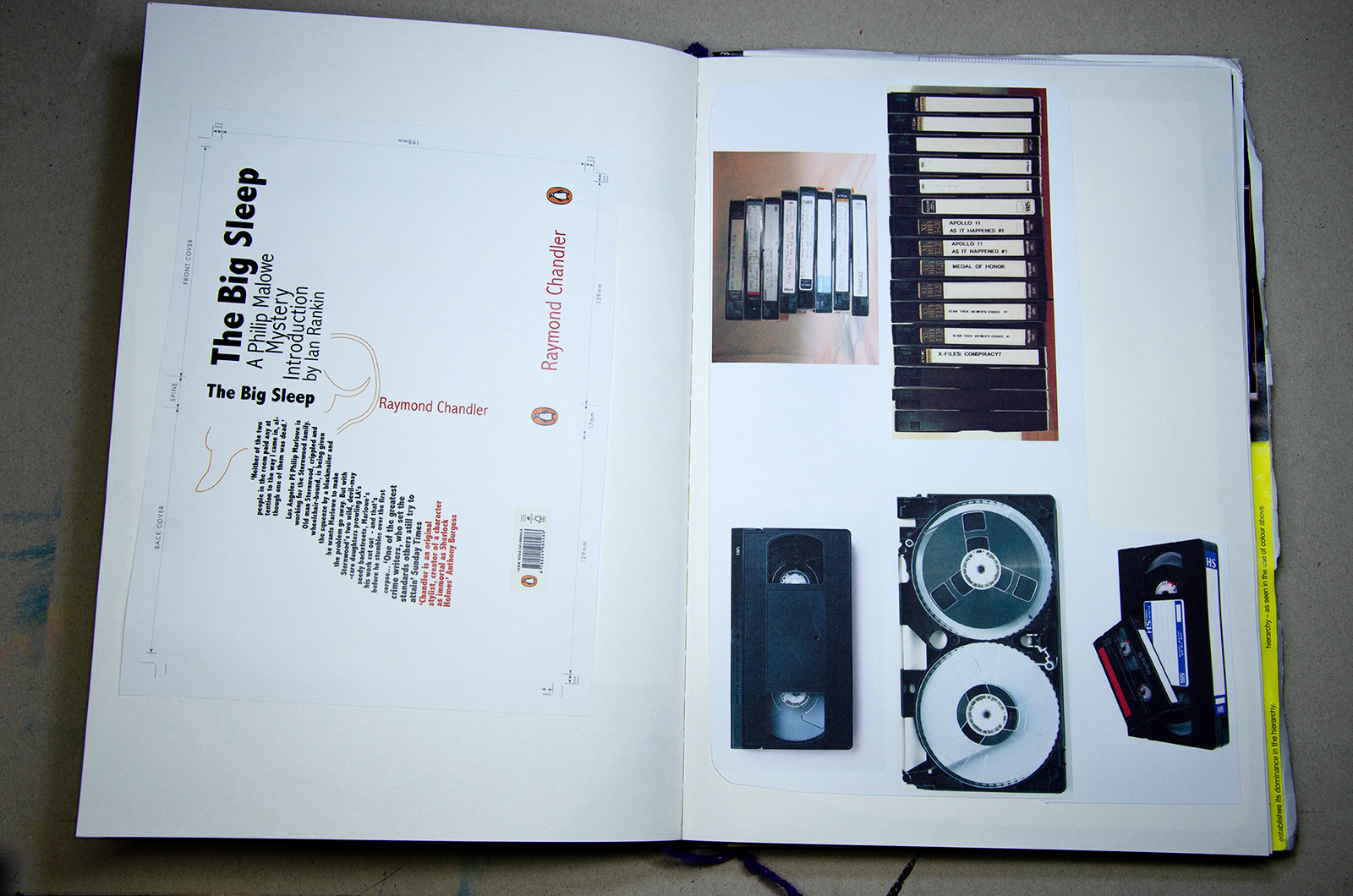
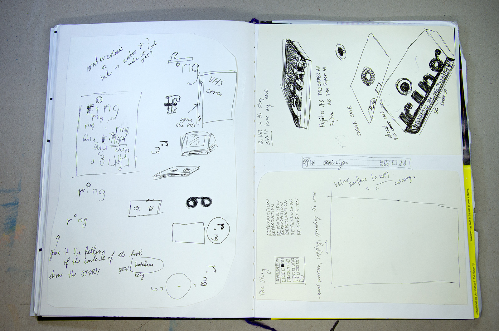
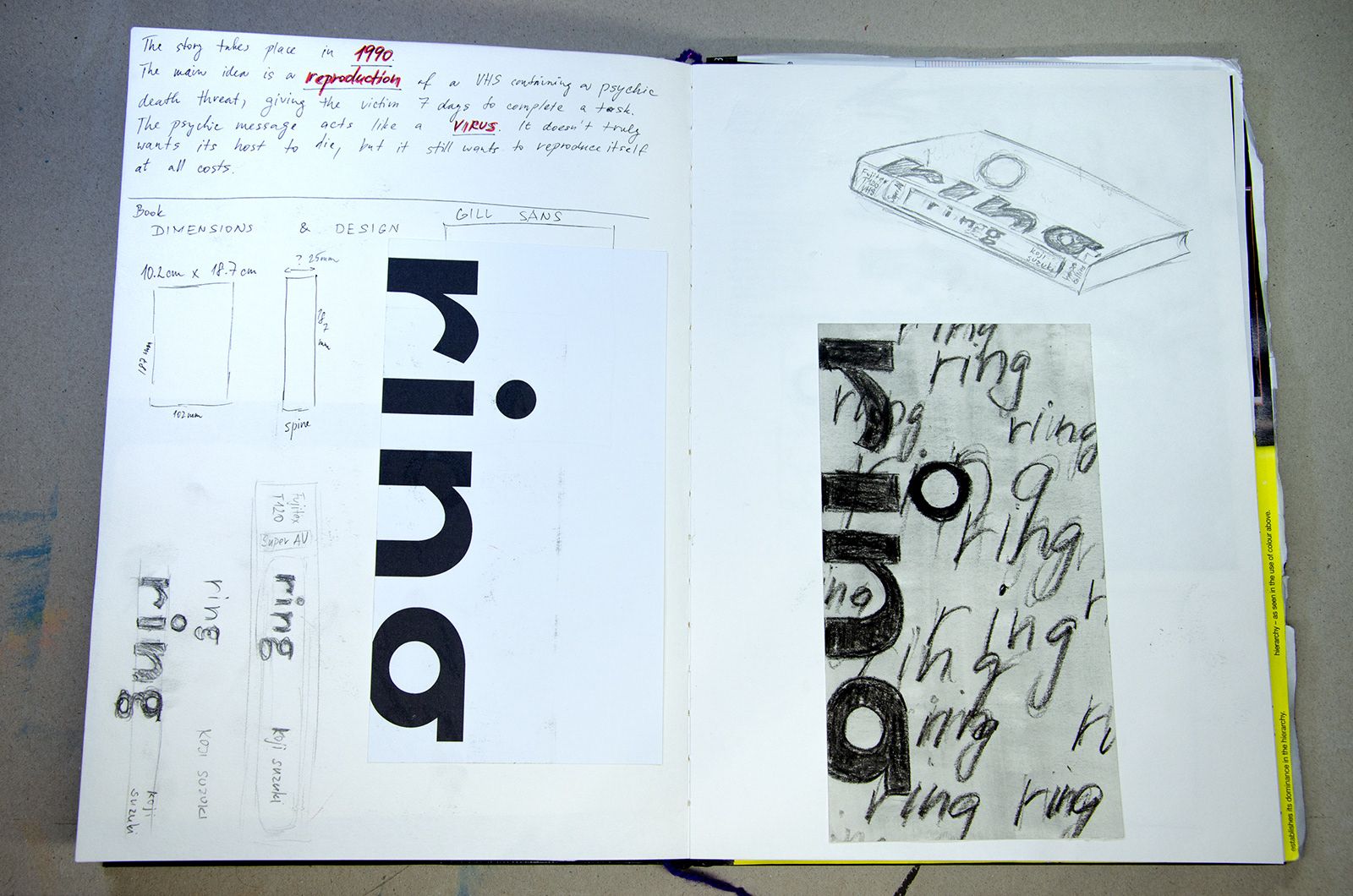
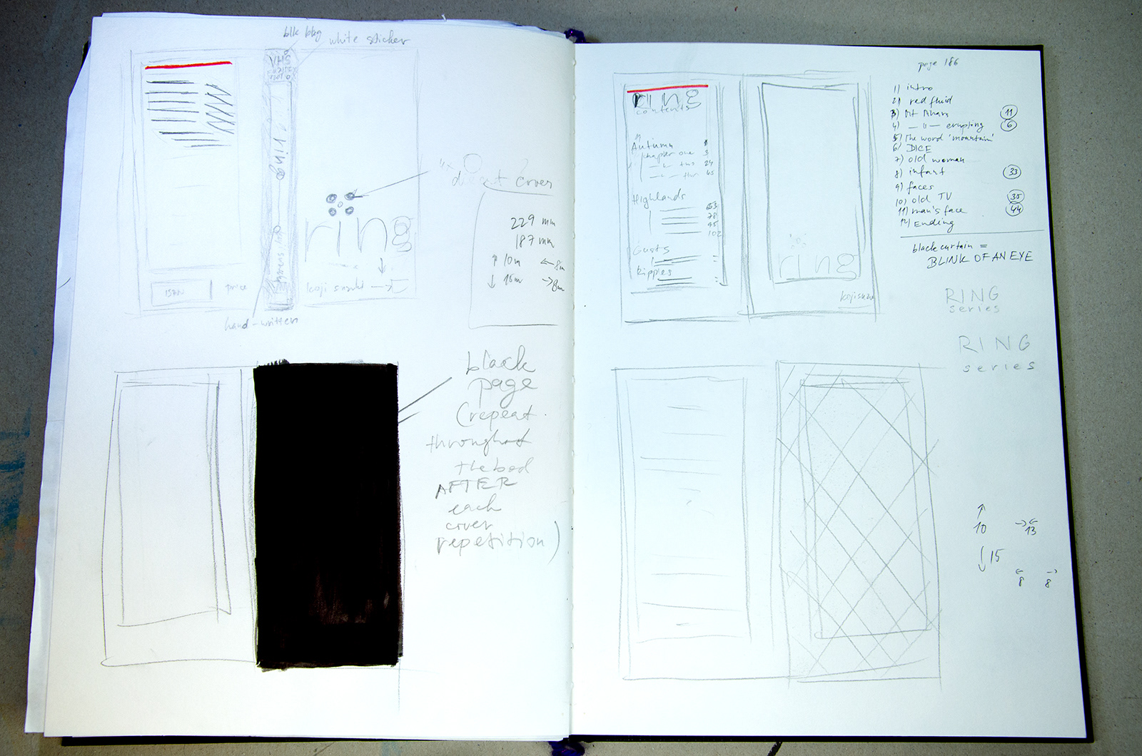
From the story it was obvious, that a VHS may be the only right choice for the size and format of the book. The psychic "virus" spreads in RING through the video recorded on a VHS tape. In the sequel SPIRAL however, the virus progresses beyond the technology.
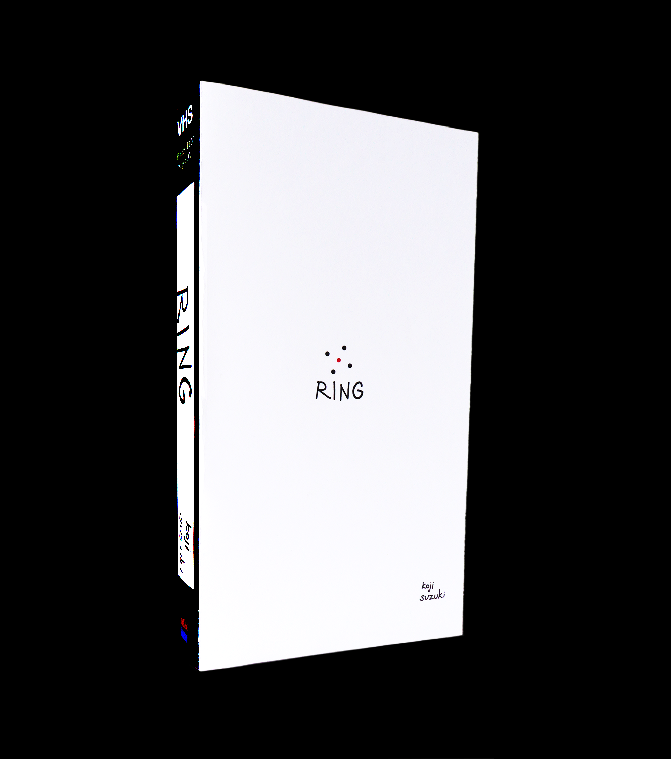
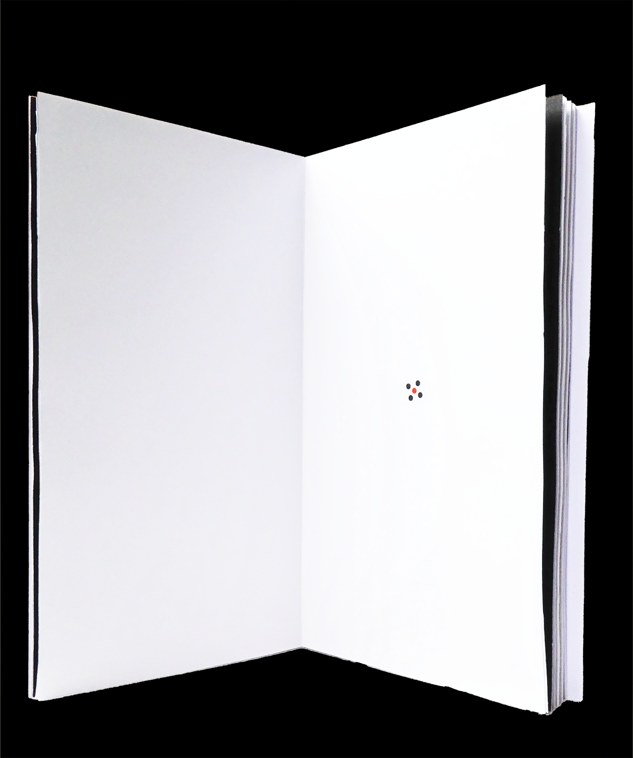
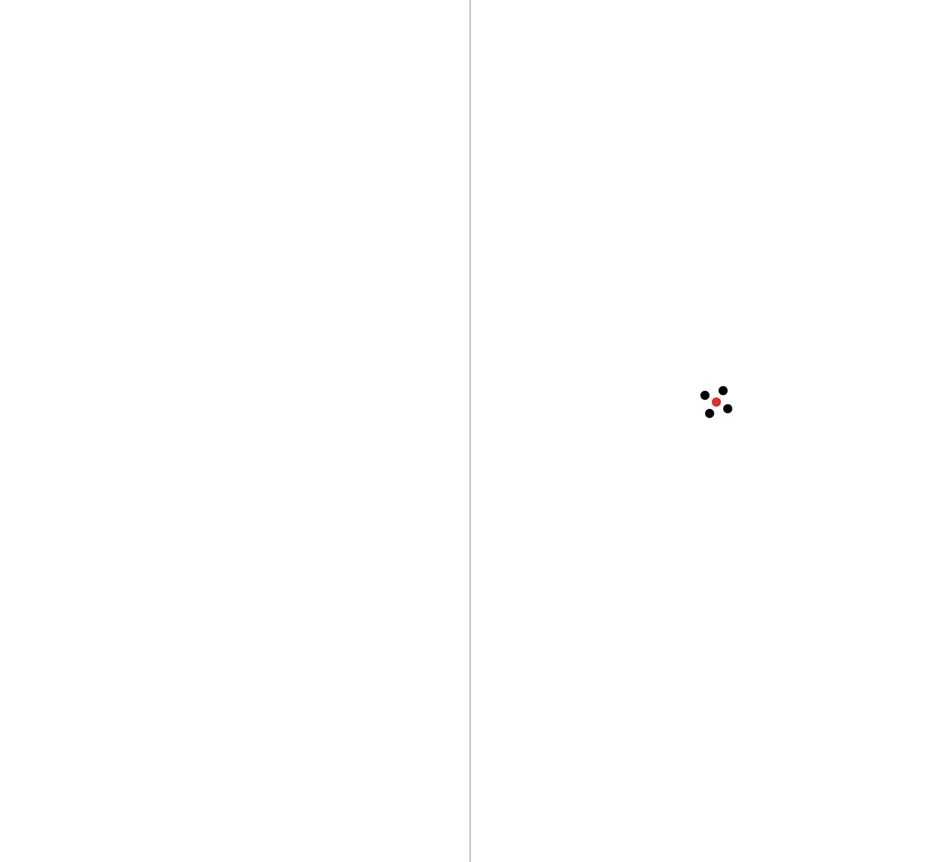
Another central piece of the story was the well into which the victim, Sadako, was thrown. I was playing with the idea of the tittle as a hollow area to represent this, or adding another tittle (the supersript dot) to stand for a well. As shown in my sketches, another option was making the dot red since there's a mention of a red sluggish fluid. However, the dot doesn't represent any fluidity at all and the idea was dismissed.
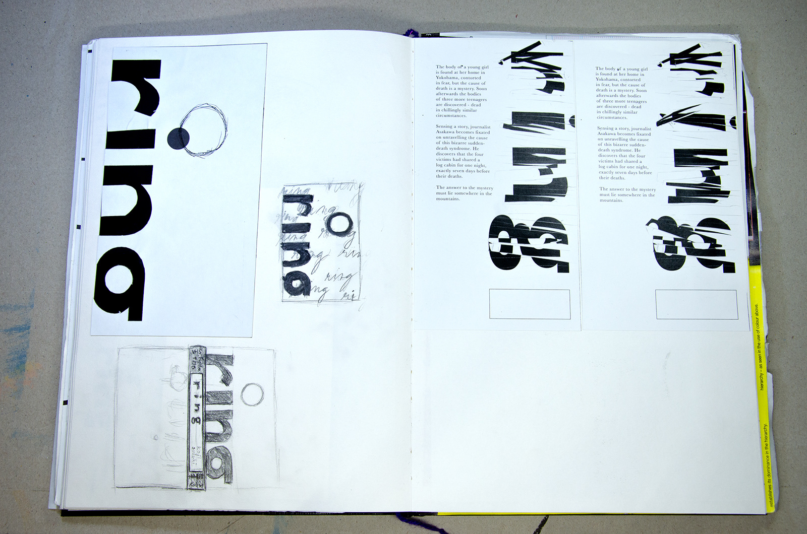
Working only with the typography, I started exploring another idea:
What was the true origin of Sadako's story?
What was the true origin of Sadako's story?
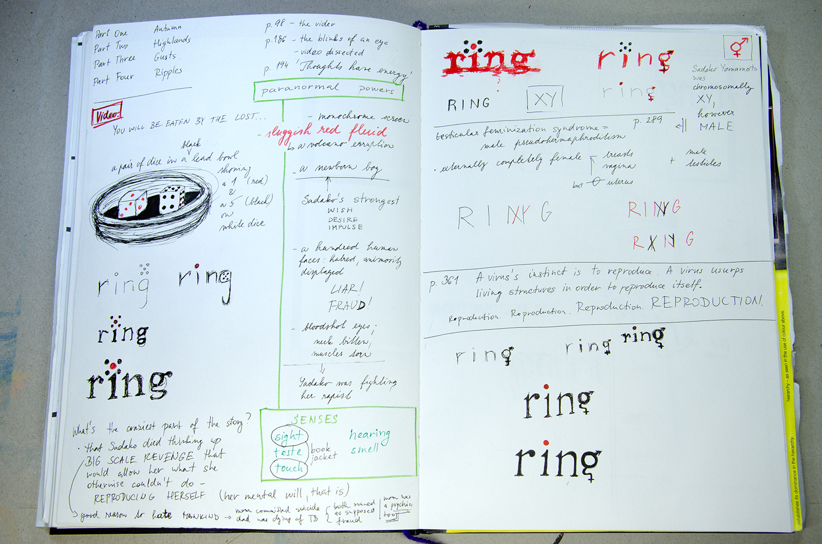
I found the answer in the scene with rolling dice. These two dice were showing a ONE and a FIVE. These dice doomed her parents. Sadako's mother, a psychic, wasn't able to read the numbers of the dice under the pressure - the people in the room wished her to fail and she indeed did. Thus she and her husband were pronounced fraud. Sadako's mother committed suicide and her father later contracted tuberculosis.
In some of my sketches the idea of combining the symbols for male and female is visible. This is yet another strong aspect of Sadako's character - while she possesses male and female genitals, she doesn't have a uterus nor a way of naturally distributing sperm. Therefore she is unable to reproduce. This idea of reproduction and the need to procreate is apparent throughout the story of RING - Sadako became a sort of a psychic virus that keeps copying itself onto others with the help of the VHS tape.
Further down, my sketches show the work on the inner layout and how the repetition of black pages binds the story visually. The readers will understand the reason for these design choices as they reach the end of RING.
I worked on multiple iterations before arriving at a satisfying result.